
LXRInsights Platform Redesign
Time
May-Aug, 2025
Roles
User experience researcher
User experience designer
User interface designer
Skills
User interview
User journey map
Wireframe
Prototype
Project type
Team Project (3 members)
Tool
Figma
Figjam
Competitor Analysis
What is the LXRInsights Platform?
LXRInsights is a marketing analytics platform that helps e-commerce businesses track, analyze, and optimize their digital advertising performance to drive better sales and ROI.
The Outcome
In this project, I focused on redesigning the overview page and experiment hub.
The videos on the right highlight the updated interface and demonstrate how the new features function in practice. The redesign simplified the layout, clarified key actions, and created a more intuitive flow, enabling users to complete tasks with fewer steps and less confusion.
As a result, stakeholders observed that the revised version not only improved usability but also encouraged higher engagement and faster adoption. These enhancements are expected to reduce task completion time by over 30% and support stronger user retention, directly contributing to the platform’s overall business growth.
Overview page
Read more detail
Experiment Hub
Before


After


Why is the LXRInsight Platform?
After doing 3 stakeholder interviews and 3 competitor analysis, we found that 3 main painpoints...
Information Hierarchy & Visual Design
-
Labels and corresponding numbers are not aligned
-
The interface appears cluttered
-
The interface uses excessive color
Usability & Guidance Design
-
Users are unsure where to click or how to apply filters
-
Important metrics are not visually emphasized
-
Marketing terms in the dashboard are difficult for users to understand
Explanation &Insight
-
The data lacks context and clear explanations
-
Users are unsure how to act on the data presented

Research
The team conducted a heuristic evaluation to uncover usability gaps, which became an important reference for product improvements. Through this process, we identified that the platform failed to follow three key design principles.
Recognition Rather than Recall
The dashboard lacks tooltips for marketing terms, leaving non-marketing users confused and forcing them to recall definitions on their own.
Flexibility and Efficiency of Use
The dashboard lacks flexibility, limiting users’ ability to adjust date ranges or choose which groups to compare.
Aesthetic and Minimalist Design
The dashboard’s gradient background creates visual noise and fails to highlight key metrics with clear, prominent colors.

Problem Statement
How might we enhance LXRInsights’ UI and UX to make it more intuitive, visually engaging, and effective for marketing and e-commerce teams with diverse technical skills?
Ideation
Based on our research, we prioritized two key areas for improving the platform.
Aesthetic
We will redesign the overall interface to ensure a more organized and structured layout.
Accessibility
We will enhance accessibility to ensure users of all experience levels can navigate the dashboard with ease.
Design- Overview Page
Overview Dashboard

❌ Problems
-
Call-to-action button lacks visual emphasis
-
Excessive background colors create visual noise and reduce focus
-
Labels and numbers are misaligned, reducing readability
-
Lack flixibility
Current design
🎨 Design Solutions
-
Eliminate the redundant color, keep the interface clear
-
Design prominent and intuitive CTA buttons
-
Maintain consistent font sizing across all elements and align the numbers and labels
-
Implement an accordion design to organize and collapse secondary information

Accordion design

✔️ New design version 1

❌ New design version 2

The team decided on Version 1, as its percentage tags are less distracting to users compared to Version 2.
Overview Comparison

❌ Problems
-
The excessive use of background colors creates visual noise and makes it difficult for users to focus
Current design

🎨 Design Solutions
-
Eliminate redundant colors to improve clarity
-
Add a feature allowing users to select comparison groups via an “Add” button for greater flexibility
New design
🎉 The new feature
Users can click the add button in the top right corner and choose which groups to compare, increasing the flexibility


Design- Experiment Page
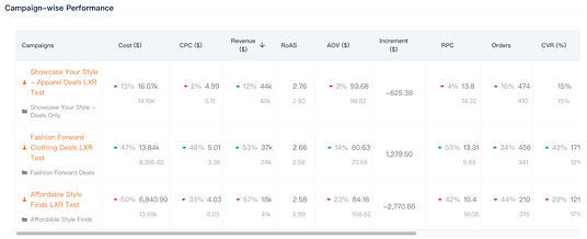
Experiment Summary

❌ Problems
-
Misaligned numbers and labels reduce readability
-
Percentage changes lack proper emphasis
-
No explanation provided for the RoAS formula, causing confusion
Current design
🎨 Design Solutions
-
Redesign the date picker to increase flexibility
-
Refine the Test vs. Control table by aligning the labels and corresponding numbers
-
Combine Total and Concluded Experiments into a single view
-
Introduce the In-Progress Experiments feature for better tracking

❌ New design version 1

✔️ New design version 2
In the first version, I applied the brand color to many elements such as tags and backgrounds. However, this created visual noise and made it harder to highlight the primary action. In the redesigned version, I simplified the color usage, which made the interface clearer and allowed users to spot the CTA button at a glance.
Experiment Table

❌ Problems
-
Search bar is not visually prominent, making it less intuitive to use
-
Table does not highlight key metrics for quick interpretation
-
CTA buttons lack clarity, reducing visibility and effectiveness
Current design

🎨 Design Solutions
-
Move the search bar to the top right corner to match common scanning patterns and dashboard conventions
-
Redesign status and result as visual tags for quicker recognition
-
Refine status wording, consolidating eight options into three clear states: Planning, In Progress, Completed
-
Add tooltips to clarify marketing terms
-
Introduce an action row to make key actions easily accessible
New design
Specific Experiemnt Page

❌ Problems
-
A weak information hierarchy makes key elements hard to identify
-
Ambiguous metric definitions confuse users unfamiliar with marketing terminology
-
Data lacks actionable insights, leaving users unsure of next steps
-
Misaligned table values reduce readability and add friction
Current design

🎨 Design Solutions
-
Redesign the overall layout and interface for improved usability
-
Add a dashboard highlighting key metrics
-
Redesign the line chart for clearer data visualization
-
Add tooltips to explain marketing terms
-
Provide descriptions for compared numbers to aid interpretation
-
Introduce the key Insights feature to surface actionable takeaways
New design
Design- Create New Experiment
On this page, the primary goal is to help users set up a new experiment without distractions.
Experiment Path & Detail


❌ Problems
-
Presence of unnecessary elements (e.g., the picture on the right, the button on the top right corner) distracts users from completing the setup
Current design
🎨 Design Solutions
-
Removed unnecessary images and the “View All Experiments” button to reduce visual clutter and keep users focused on core tasks
-
Centered key information to make critical content immediately visible and enable quicker decision-making
-
Designed a clear, intuitive progress bar to provide a sense of progress and give users a greater sense of control


New design
Experiment Detail

❌ Problems
-
The CTA button lacks prominence, making it unclear where users should begin.
-
The interface layout does not follow familiar design patterns, which may disrupt users’ expectations and navigation flow
-
The setup steps are scattered across multiple pages, forcing users to switch back and forth during the process
Current design

🎨 Design Solutions
-
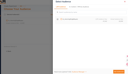
Simplified the setup process by combining audience selection, campaign control, and budget & timeline settings into a single page
-
Applied a drop-down menu for audience and campaign selection, streamlining interaction and giving users greater flexibility
New design
🎉 Look at how it works!
I applied a combo box for audience selection and campaign control, saving space for information display while offering multiple search options to support users of different experience levels.
Feedbacks
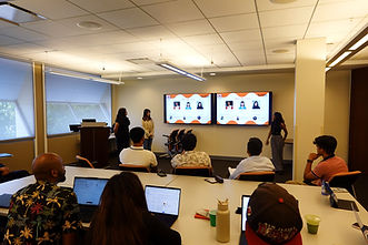
At the end of the project, we delivered a hand-off presentation at the NetElixir office to the LXRInsights product team. We shared our research findings, highlighted usability issues, and presented our design solutions. The team’s feedback affirmed the clarity and practicality of our work and gave us valuable insight into how our recommendations could support future product improvements.
How stakeholders say?
CEO
"Simplicity is the most important thing. It makes the information clearer and more professional."
Product Marketing Manager
“I really like the new experiment page. Even though I’m not a professional marketer, I can easily understand all the information.”
Project Manager
“When I see the original design, I'm not sure what's going wrong. When comparing the new one together, everything makes sense.”
Reflection
Through this project, I learned how to balance user needs with business goals and how important communication is in reaching that balance. The process showed me that design is not only about solving usability issues but also about creating solutions that make sense for both users and the business.
I am sincerely grateful to our mentors Angela, Khalid, and Michelle for their guidance and thoughtful feedback. They encouraged us to think more deeply about our design choices and to articulate not only what we designed but also why. I also want to thank my teammates Rashi and Natasha. Our weekly Thursday meetings gave us the space to share ideas openly, discuss different directions, and make decisions together. This collaboration taught me how effective communication and trust within a team can turn challenges into meaningful outcomes.
Finally, I am thankful for the opportunity to work on this project with NetElixir and for the support from the MBS program, which made this experience possible.


