
Runited
Where campus life comes together.
Time
Oct 2024
Roles
User experience researcher
User experience designer
User interface designer
Skills
User interview
User journey map
Usability testing
Wireframe
Prototype
Project type
Team Project (6 members)
Tool
Figma
Brief
We aimed to help Rutgers University students foster a greater sense of community to encourage open communication and empathy among students.
We conducted more than 20 user interviews to gain a comprehensive understanding of students' social experiences and performed usability testing with six participants. Based on their feedback, we refined the design, resulting in a 25% increase in user engagement.

The Project Challenge
How to Design a Product in One Week?
We had only one week to finalize the design, so our team focused on two different types of students and prioritized three main functions based on six ideations.

The Outcome
Feature 1
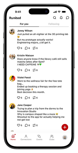
Explore the Community
A casual space to share life updates, ask questions, and keep the conversation going.

Feature 2
Let AI Help You with Everything
An AI assistant delivers personalized, campus-specific answers to support student needs and daily activities.
Feature 3
Make Connections More Easily
Users can connect with peers who share similar backgrounds or interests.


Feature 4
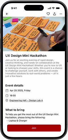
Enrich Your Social Life
Users can easily discover campus events and student clubs based on their interests.
Feature 5
Manage Your Time Perfectly
RUnited has a campus calendar that helps users manage their time. After getting the event tickets, users can add the event to the RUnited calendar with a click.


Impact
More than 80% of users found the app effective in helping them connect with others, resulting in a satisfaction rating of 8.3/10.
Potential Business Value
Potential user base
70,000
Target penetration rate
30%
$210,000 /year, each campus
There are more than 4,000 colleges and universities in the United States, with the potential to expand to other campuses.
ARPU (average revenue per user)
$10
Problem Statement
-
In 2024, universities face increased societal polarization, leading to divisions and hindering constructive dialogue.
-
Rutgers aims to foster a greater sense of community to encourage open communication and empathy among students.
Goal

Help Rutgers Students Easily Find Study Groups and Project Partners and Engage in Skill-sharing Opportunities.
Project Approach
User interview
We did user interviews with 20 students to understand the students’ social experiences and identify areas for improvement.

1
Ideation
Each member designed a solution, and then we had a design critique workshop to find a suitable ideation.

3
Usability testing
We conducted usability testing with six users and collected feedback to iterate our design.

5
Research
We analyzed the interview to identify key pain points. After gaining valuable insights, we created a user journey map to explore further and address these challenges.
2
Wireframe & prototype
We start working on the wireframe and prototype based on the final ideation.
4
What Did We Find From the Interview?
Key insight 1
Students Who Have the Same Background Easily Become Friends
“ I usually make friends in the club."
“ I know the people who are from the same high school."


Key insight 2
Students Meet Friends Both in Person and in a Virtual Way
"I meet my friends online for efficiency."
"I meet my friends at lunchtime."
Key insight 3
Time Scheduling and Not Actively Responding are Pain Points When Using a Virtual Way
"It’s difficult to do the online assessments/classes because people don't respond on time."

Research Insights
Based on the secondary research, we found that social media helps teens deepen connections and provide a support network when they need it.
80%
of teens
say that what they see on social media makes them feel more connected to what’s going on in their friends’ lives.
71%
say social media makes them feel like they have a place where they can show their creative side.
of teens
67%
say social media platforms make them feel as if they have people who can support them through tough times.
of teens
The problem with the current design
❌ Lacks Essential Features that Foster Student Interaction, Idea Sharing, and a Sense of Belonging
Despite providing event information, the school website fails to support meaningful student interaction or community engagement, leaving students with limited avenues to connect, collaborate, or feel a part of campus life.


How Might We Support the Student Community and Help Them Establish the Connection More Easily?
Ideation
💡
Based on previous interviews and research, our team decided to design an application aimed at providing a platform for students to share their ideas and centralize all networking resources, including various events and clubs, to facilitate easy access for students.
Competitor Research

Persona
Goal: Build connection for work

Sarah
Age
Status
Residency
21
Undergraduate
In-state,
Off-campus,
Commuter
Needs
Build post-grad connections for career opportunities
Find job-related resources to enhance her professional skills
Expand her network by joining workshops, professional clubs, and networking events
Behavior
Enjoys meeting friends in person and making plans
Spends a lot of time studying to maintain academic performance
Uses Discord, GroupMe, Instagram, and LinkedIn to stay connected and informed
Pain Points
Scheduling conflicts—balancing school, networking, and social life is difficult
Long commute—spends a lot of time traveling to campus
Pressure & stress—feels overwhelmed balancing career planning, academics, and personal life
Goal: Adopt the foreign life

Sam
Age
Status
Residency
25
Graduate
International,
Off-campus,
Commuter
Needs
Connect with students who share his interests and background to feel more at home
Engage in activities that help him overcome cultural and language barriers
Manage time effectively to study while also finding job opportunities
Behavior
Search job networking events nearby
Full-time student with a strong focus on academics
Introverted—feels more comfortable connecting online before meeting in person
Uses Message & Instagram for texting and staying in touch
Pain Points
Cultural differences & language barriers make it difficult to connect with others
Struggles with finding ways to get involved at Rutgers and networking
No personal transport—relies on public transit (bus) to get around
User Journey Map

Site Map
Through a user survey involving three participants, we conducted a card-sorting activity to identify which features users consider most helpful for community engagement. The results indicated that connection, events, and posts are the top three features valued by users.


These three functions are defined as the primary pillars of the user experience and serve as the foundation for the app’s information architecture.

Wireframe
The design of the
connections page
Two versions of the connection page were designed to explore differences.
Version A displays two friend cards per row, allowing users to view more profiles at once. However, each card shows limited information.
In contrast, Version B presents one friend card per row, providing richer profile details, including interests and a clear “Add” button, but displaying fewer users on a single screen.
How users said...
Most users preferred Version B because it allowed them to see more profile details at a glance without needing to click on each profile. They found scrolling through detailed cards less tiring and more efficient than repeatedly navigating in and out of individual profiles.
👍🏻
Version A

Version B

The design of the
events page
Version A displays multiple event categories on a single page. Each row represents a different category, and users can scroll horizontally within each row to browse more events.
In contrast, Version B focuses on one category at a time, presenting events in a vertical list. Users can scroll down to view more events within the selected category and switch between categories using the filter chips at the top.
How users said...
Most users preferred Version B because it allowed them to focus on one event category at a time, which helped reduce cognitive load. They also appreciated the cleaner layout and additional space, making it easier to read and understand event details without feeling overwhelmed.
👍🏻
Version A

Version B

Usability Testing
Six users participated in the usability testing, completing five tasks and providing feedback through the System Usability Scale (SUS) questionnaire.
Task
Users completed tasks involving student search and connection, event and club exploration, and AI-assisted event discovery. The flow included viewing profiles, registering for activities, and navigating through information pages. These scenarios reflect common interactions within the platform.
SUS evaluation
77.5/100
The overall usability falls within the “Good” range, approaching the threshold of “Excellent".
User's satisfaction
8.3/10
Users felt that the app provided a smooth and helpful experience, especially in making new connections more accessible.
Iteration
👍🏻 Enhanced the club page by showcasing more upcoming events
Some users wanted to see all the clubs' information on one page, so we integrated club events into the club page to make it easier for users to access relevant information without moving to the event page.

Before

After
Design system

Reflection
I’m grateful for the opportunity to design a social app for our school, aiming to help students better integrate into campus life. Through user interviews, we gained valuable insights into students’ real needs and pain points, allowing us to create a product that truly reflects their expectations.
The design critique workshop was a powerful tool for team collaboration, enabling us to explore different perspectives and identify more practical design solutions. Usability testing also played a crucial role in revealing hidden issues and improving the user experience, an essential part of the iterative design process.
This project gave me a hands-on understanding of the full product design journey—from identifying problems and designing solutions, to continuous testing and optimization. I look forward to further enhancing the product by adding useful features and turning it into a tool that students can rely on in their daily lives.

🎉 Got my certification for the Intro to UXD
